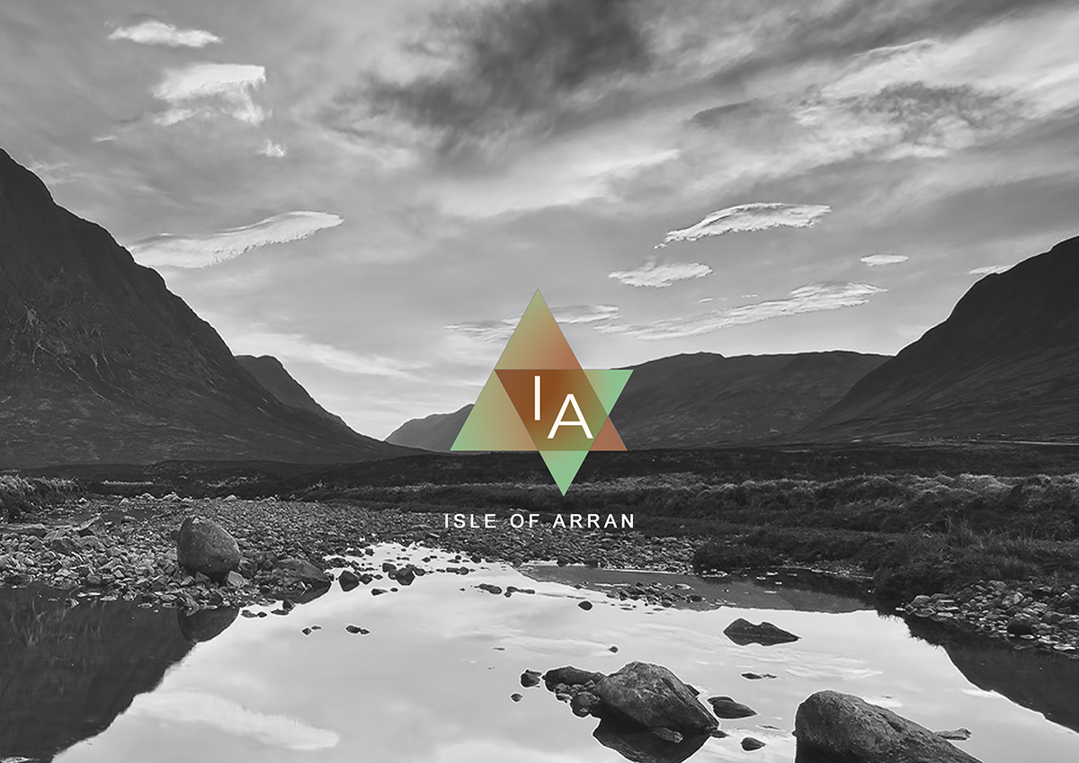

CORPORATE IDENTITY PROJECT:
-Choosing the name of a gender equality and ecological cosmetics brand
Products originally coming from the Isle of Arran -Scotland.
-Logo design for the company
Choosing the typography and the shape of a binary brand using geometrical shapes.
-Product design
As this is an agender brand, I chose two triangles as the shape of the brand, and the product needed to have the same shape. We designed a range of cosmetics all in clear white and geometrical shape.
-Packaging
Following the corporate identity, the colour for the packaging is white, clean and ethereal colours, because the soul does not understand about gender.
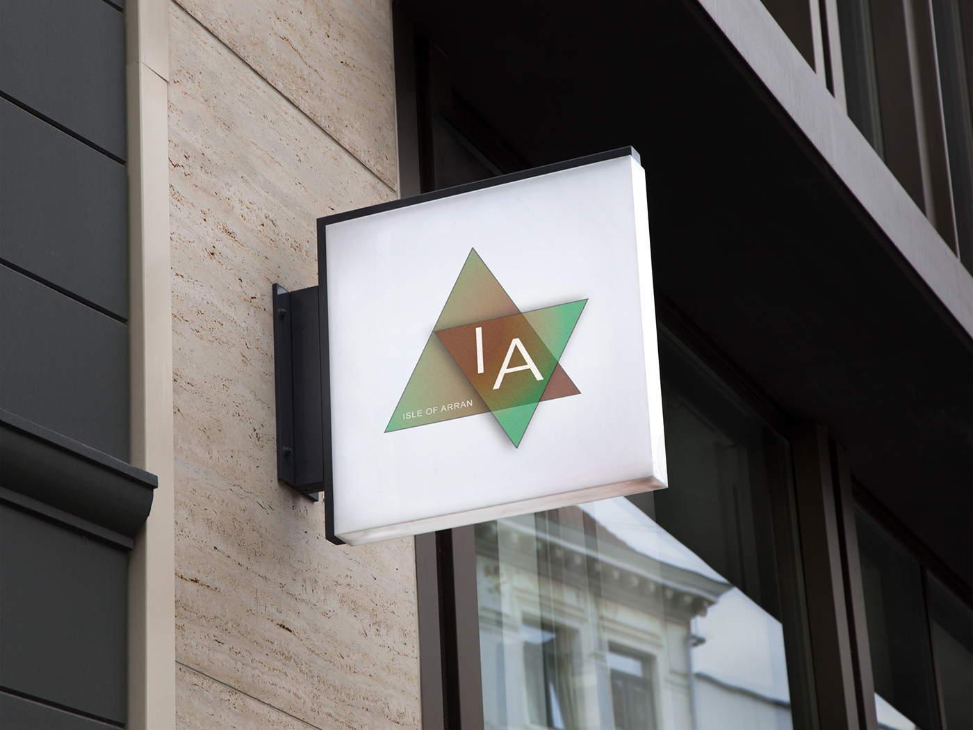
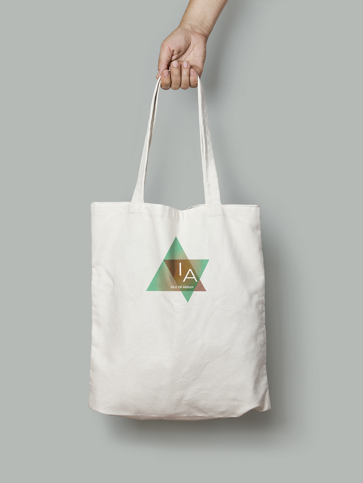
-Advertisement
BUSINESS CARDS

PACKAGING

PRODUCT DESIGN

SHOP SIGNAGE
PACKAGING


<a href='http://www.freepik.com/free-vector/triangles-background-in-hand-drawn-style_768990.htm'>Designed by Freepik</a>


